Visualisation
Plotting functions are available as methods on Magnet and Arrangement, and
as free functions in microcubed.viz. Each coordinate is either fixed or
varying:
fixed section:
z=-150uniform range:
x=(-500, 500, 201)explicit coordinates:
x=np.array([...])
Source geometry
All examples below use the same cuboid; lengths are in nm. White outlines on
plane maps are projections of the source’s union_boundary, not intersections
with the sampling plane.
import matplotlib.pyplot as plt
import numpy as np
from microcubed import Magnet

magnet = Magnet([200, 120, 60], [0, 0, 0], [0, 0, 8e5])
print("Projected XY material boundary (nm):\n", magnet.union_boundary("xy"))
Projected XY material boundary (nm):
 [array([[-100.,  100.,  100., -100., -100.],
       [ -60.,  -60.,   60.,   60.,  -60.]])]
1D line section
Exactly one axis must vary:
fig, ax = magnet.plot_1d(
    x=(-500, 500, 201),
    y=0,
    z=-150,
    component="z",
    color="tab:blue",
)
plt.show()
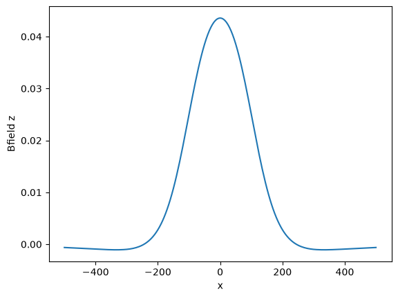
Without component, \(|\mathbf B|\) is plotted.
Gradient components are selected as (derivative axis, field axis):
fig, ax = magnet.plot_1d(
    x=(-500, 500, 201),
    y=0,
    z=-150,
    what="dBfield",
    component=("x", "z"),
)
plt.show()
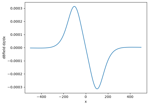
This displays \(\partial_xB_z\).
2D plane section
Exactly two axes must vary:
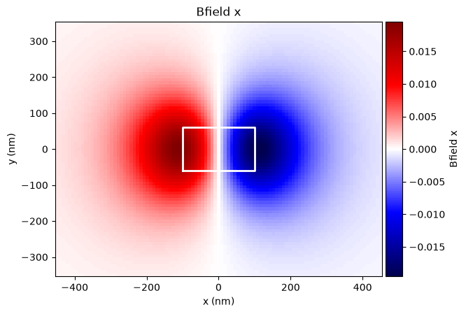
fig, ax = magnet.plot_2d(
    x=(-450, 450, 101),
    y=(-350, 350, 81),
    z=-150,
    component="x",
    cmap="seismic",
)
ax.set_aspect("equal")
for boundary in magnet.union_boundary("xy"):
    ax.plot(*boundary, "w-", linewidth=2)
ax.set(xlabel="x (nm)", ylabel="y (nm)", aspect="equal")
plt.show()
Gradient heatmap:
fig, ax = magnet.plot_2d(
    x=(-450, 450, 101),
    y=(-350, 350, 81),
    z=-150,
    what="dBfield",
    component=("y", "z"),
    cmap="seismic",
)
for boundary in magnet.union_boundary("xy"):
    ax.plot(*boundary, "w-", linewidth=2)
ax.set(xlabel="x (nm)", ylabel="y (nm)", aspect="equal")
plt.show()
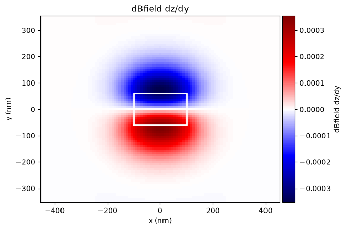
For a gradient with component=None, the Frobenius norm of the full 3×3
matrix is displayed.
3D vector field
All three axes must vary:
fig = plt.figure(figsize=(9, 6))
ax = fig.add_subplot(projection="3d")
fig, ax = magnet.plot_3d(
    ax=ax,
    x=(-400, 400, 12),
    y=(-300, 300, 10),
    z=(-300, -100, 5),
    max_points=600,
    normalize=True,
    length=35,
)
from mpl_toolkits.mplot3d.art3d import Poly3DCollection

faces = magnet.corners.T[[[0, 1, 3, 2], [4, 5, 7, 6], [0, 1, 5, 4], [2, 3, 7, 6], [0, 2, 6, 4], [1, 3, 7, 5]]]
ax.add_collection3d(Poly3DCollection(faces, alpha=0.15, edgecolor="black"))
ax.set(xlim=(-400, 400), ylim=(-300, 300), zlim=(-300, 40))
ax.set_box_aspect((800, 600, 340))
ax.set(xlabel="x (nm)", ylabel="y (nm)", zlabel="z (nm)")
# Leave room between the 3D tick labels and the colorbar.
ax.set_position([0.02, 0.08, 0.68, 0.84])
fig.axes[-1].set_position([0.87, 0.22, 0.025, 0.56])
plt.show()
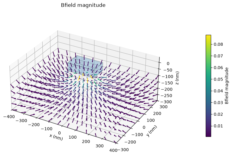
Arrows show the vector field; their colour encodes its magnitude by default.
max_points limits arrow count. 3D quiver plots support Bfield and Hfield,
not the rank-2 gradient tensor.
Existing Matplotlib axes
import matplotlib.pyplot as plt

fig, ax = plt.subplots(figsize=(6, 4))
magnet.plot_2d(
    x=(-450, 450, 101),
    y=(-350, 350, 81),
    z=-150,
    component="z",
    ax=ax,
    colorbar=False,
)
for boundary in magnet.union_boundary("xy"):
    ax.plot(*boundary, "w-", linewidth=2)
ax.set(xlabel="x (nm)", ylabel="y (nm)", aspect="equal")
plt.show()
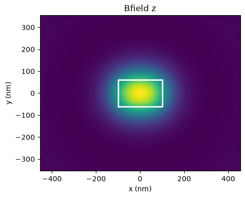
Additional keyword arguments are forwarded to Axes.plot, Axes.pcolormesh,
or Axes3D.quiver respectively.
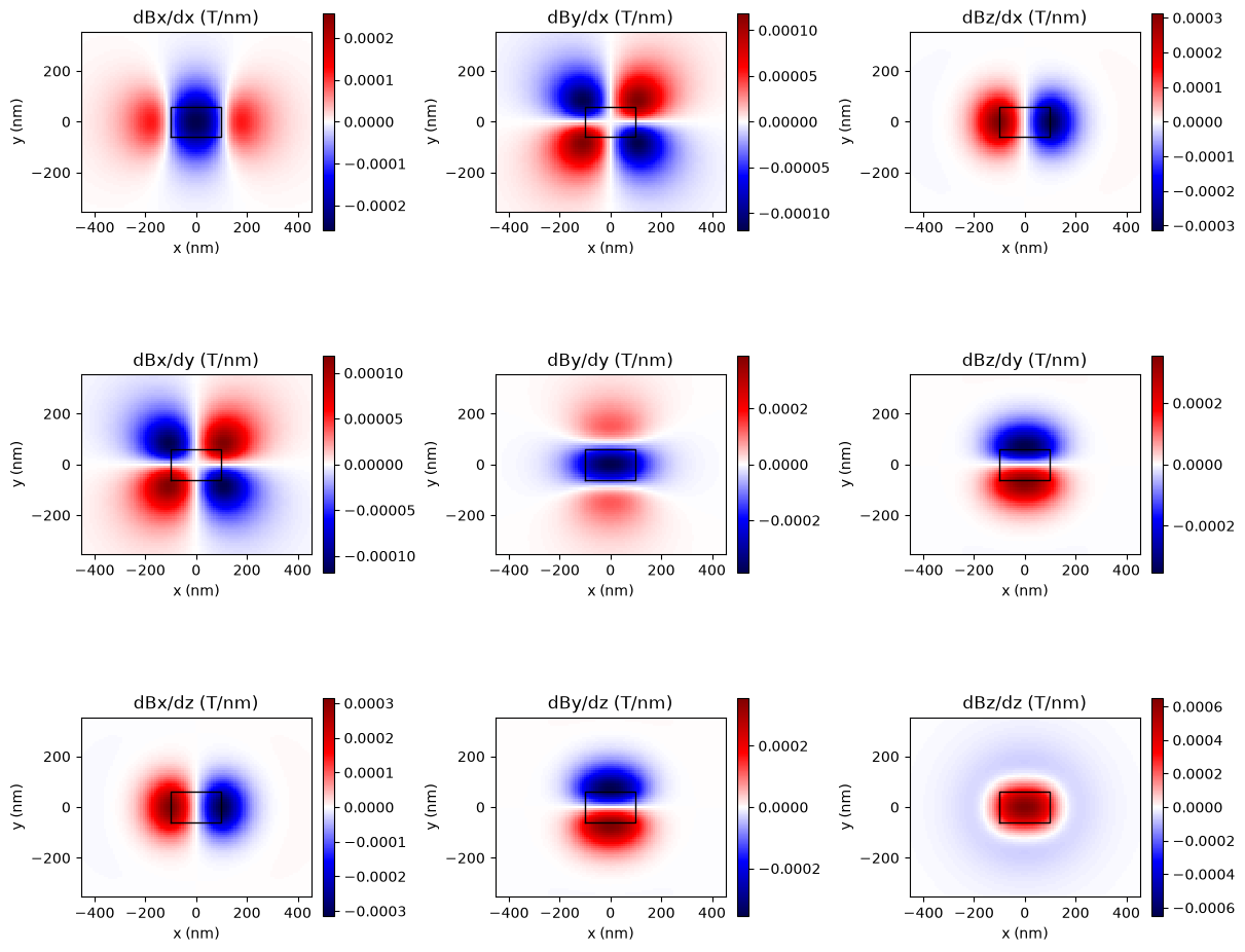
All nine gradient components
For a publication figure in a 3×3 layout, use sample_field directly:
import matplotlib.pyplot as plt
import numpy as np
from microcubed import sample_field

(x, y, z), dB = sample_field(
    magnet,
    x=(-450, 450, 101),
    y=(-350, 350, 81),
    z=-150,
    what="dBfield",
)
dB = dB[..., 0]

fig, axes = plt.subplots(3, 3, figsize=(12, 10), constrained_layout=True)
for derivative in range(3):
    for component in range(3):
        values = dB[derivative, component]
        limit = np.nanmax(np.abs(values))
        image = axes[derivative, component].pcolormesh(
            x,
            y,
            values.T,
            shading="auto",
            cmap="seismic",
            vmin=-limit,
            vmax=limit,
        )
        fig.colorbar(image, ax=axes[derivative, component], shrink=0.65)
        for boundary in magnet.union_boundary("xy"):
            axes[derivative, component].plot(*boundary, "k-", linewidth=1)
        axes[derivative, component].set(
            title=f"dB{'xyz'[component]}/d{'xyz'[derivative]} (T/nm)",
            xlabel="x (nm)", ylabel="y (nm)", aspect="equal",
        )
plt.show()